

Statistical charts provide a visual representation of data in the statistical data (SD) list.
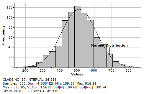
A histogram shows the frequency distribution as a series of bars, where each bar represents an interval in the value data range. You can select the number of classes (bars) or have DreamCalc determine a suitable number using Scott's Rule by selecting "Auto" from the drop-down list.
To display a histogram, put the calculator into the SD mode and populate the SD list with value-frequency data. Finally, select Histogram from the Graph→Statistical Charts sub-menu.
An example of both a histogram and the cumulative variation are shown below:
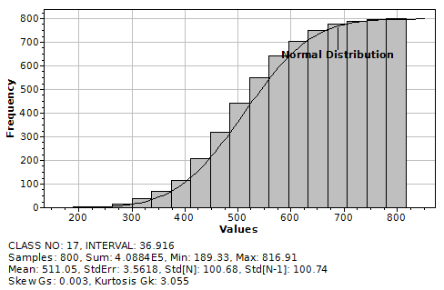
A cumulative chart can be shown for both histograms and frequency polygons. In addition, the axes may be set to show relative values. These settings can be found under the Graphing Window's Axes menu; for example, select Axes→Cumulative Chart.
In addition, you can use the Show Normal Distribution option under the Graph→Statistical Charts menu to toggle a Gaussian curve fit to the underlying data.
The frequency polygon chart is similar to a histogram (above), but shows the frequency distribution as a single line rather than a series of bars.
The bar chart displays values as a bars, in the order the they are listed, with bar widths proportional the corresponding frequencies.
Professional Edition Only. A Normal Quantile-Quantile (Q-Q) plot is a graphical technique used to determine whether the data is normally distributed.
An example Q-Q Plot is shown below:
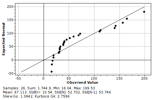
The x-axis shows the values in SD list, while the y-axis shows the expected corresponding values of a normal distribution with the same mean and standard deviation of the data. The closer the points lie to the 45° line, the closer the data resembles a normal distribution. A departure from the central line, for example, suggests that data is heavily tailed.
The axes of the Q-Q chart may be shown in terms of normalized variate Z values by selecting Relative Chart from the Axes menu.
See also: Graphing & List Window, Statistical Calculations